Element Properties
When an element is selected one or more tabs display in the properties area. The chart below provides a quick overview of which tabs are used by the various element types:
|
|
Properties Tabs |
|||||||||
|---|---|---|---|---|---|---|---|---|---|---|
|
Element Type |
General |
Caption |
Logic |
Check |
Validation |
JavaScript Extender |
Columns |
Card Field |
Notification Button Logic |
|
|
Attachment List |
X |
|
X |
|
|
|
|
|
|
|
|
Constraint Clear Button (p. 1) |
X |
|
X |
|
|
|
|
|
|
|
|
Copy Value Button (p. 1) |
X |
|
X |
|
|
|
|
|
|
|
|
Cross Reference** |
X |
|
X |
|
|
|
X |
|
|
|
|
Custom * |
X |
X |
|
|
|
|
|
|
|
|
|
Event Timeline** (p. 1) |
X |
|
X |
|
|
|
|
X |
|
|
|
Field |
X |
X |
X |
X |
X |
X |
|
|
|
|
|
Form Letter Toolbar |
X |
|
|
|
|
|
|
|
|
|
|
Html Link Grid** |
X |
|
X |
|
|
|
X |
|
|
|
|
Inline Grid |
X |
|
X |
|
|
|
X |
|
|
|
|
Person Involved Tab*** |
X |
|
X |
|
|
|
|
|
X |
X |
|
Picktree |
X |
X |
X |
|
|
|
|
|
|
|
|
Popup Grid |
X |
|
X |
|
|
|
X |
|
|
|
|
Review Tab*** |
X | X | X | X | ||||||
|
Static Label |
X |
|
|
|
|
|
|
|
|
|
|
Vertical Tabs** |
X |
|
X |
|
|
|
|
|
X |
|
|
* The Custom elements is used in RL6:Claims to enable complex form ** The Cross Reference, Event Timeline, Html Link Grid and Vertical Tabs elements are used in RL6:RootCause and PeerReview only. ***The Person Involved Tab and Review Tab elements are used in RL6:PeerReview only. |
||||||||||
|
Tab |
Field |
Element Type |
Description |
|---|---|---|---|
|
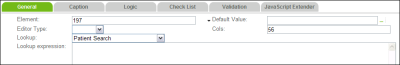
Note: All elements have a general tab, but the fields contained within vary by element type. In this graphic, a Field element has been selected. |
|||
|
Attach ID |
Followup Toolbar |
Used to link follow-up attachments with the followup toolbar; this ensures that the attachment is included should the follow-up be emailed to another user. The value entered here should match the id field of the Attachment element in the follow-up popup grid. |
|
|
Cross Reference |
For RL6:PeerReview or RL6:RootCause users, this option allows you to choose cross-references that can be used for the selected entity under which the cross-reference component was added. For RL6:PeerReview:
For RL6:RootCause, when configuring action plans using the entity 600006 (RCA Action Plan), you can choose one option: Investigation Items and Action Plans to link investigation items with action plans. |
||
|
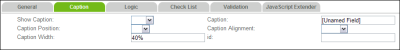
Caption |
Attachment List |
The name of the element type as it will appear on the form. This value appears above the element and does not support HTML tags. |
|
|
Caption Alignment |
Popup Grid |
The location of the caption with respect to the top of the grid. |
|
|
Child Ids |
Popup Grid |
Show an embedded child pop up grid. This feature should only be used by RLDatix. |
|
|
Cols |
Field |
Determines the width of the element within the cluster. The unit is the percentage of the cluster. Entering |
|
|
|
Css Class |
Followup Toolbar |
This field is read only. It is reserved for future use. |
|
|
Default Value |
Field |
Sets the value of this field when the form is opened. Depending on the element ID, a list may appear when you click the ellipsis. |
|
|
Editor Type |
Field |
This indicates whether the field should be hidden or visible on the form. If the field is automatically populated you may wish to hide the field from the user. For example, the file number field is on every form but is hidden because it is automatically calculated. The options are |
|
|
Element |
Field Pick Tree |
For a field element, use the field picker to search for and select the field to add to the cluster. |
|
|
Embed Pick Tree |
Pick Tree |
Choose an option: True or False |
|
|
Entity |
Attachment List |
A required field for the listed element types that determines the table from which fields may be selected for the grid. A grid may only contain fields from the table selected here. For attachments, you should always select table to which the attachment is related, such as Patient Outcomes. Click the ellipsis icon to choose the table caption. |
|
|
Filter By |
Popup Grid |
Determines the filter used in a Popup grid |
|
|
Filter Expression |
Popup Grid |
Used when the Popup Grid needs to show the embedded child Popup Grid. It specifies the condition to show which child grid shows when the parent Popup Grid row is selected. This feature should only be used by RLDatix developers. |
|
|
Header Visible |
Attachment List |
Determines whether or not the attachment element’s caption is visible on the form. |
|
|
Hide Add Button |
Popup Grid |
Removes the Add link that appears below the popup grid. |
|
|
ID |
Popup Grid |
Provides a unique ID for the attachment/grid if you wish to display, hide or require an attachment based on a selection made from another field. |
|
|
Pick Tree |
The number of pixels by which the pick tree is indented. |
|
|
|
Left Panel Width (%) |
Event Timeline |
Increases the width of the left panel and hides the attachment list. Enter a percentage value to determine the increase in width. |
|
|
Field |
Associate a lookup with the section to display the magnifying glass icon next to the section title. Clicking the icon opens the associated lookup Note: Lookups are not available in forms used in the Mobile application. |
|
|
|
Lookup Expression |
Field |
Used to dynamically select which lookup to use for the field. If the General Event Type is ADR, for example, the is patient lookup should be used; otherwise, the staff lookup is used. Note: When a lookup visibility expression is configured for a responsive form, a default lookup needs to be selected. |
|
|
Note ID |
Followup Toolbar |
Used to link the follow-up description with the followup toolbar to ensure that the selected form letter is inserted into the correct field. The value entered here should match the id field of the Description field in the follow-up popup grid. |
|
|
Property Name |
Attachment List |
The PropertyName field, which is a hidden field in the IncidentAttachments table, can be automatically populated with the value entered here. |
|
|
Repeat Columns |
Pick Tree |
The number of columns in which the options selected from the pick tree are displayed. |
|
|
Show Attachment List |
Popup Grid |
Determines whether or not the attachment added to grid record can be viewed from the table ( |
|
|
Show Caption |
Popup Grid |
Select either |
|
|
# of Links to be Added |
Cross Reference |
For RL6:PeerReview and RL6:RootCause users, choose one of the following options:
Note: To support associating multiple reviewers or providers with a single view, the calculated Reviewer ID and Provider |
|
|
|||
|
|
Field |
The name of the selected field as it will appear on the form. If left unchanged the name will display the form caption as defined in the field’s properties (Adding or Editing Fields). |
|
|
|
Caption Alignment |
Field |
Captions can be |
|
|
Caption Position |
Field |
Select |
|
|
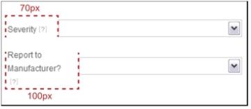
Caption Width |
Field |
Determines how much space (in pixels) appears between the start of the caption and its associated field. When left blank, the caption takes up approximately 40% of the space allotted for the caption and field. If a value is entered that is smaller than the space required to show the label, the field appears right after the caption or if the caption contains more than one word, it will wrap to the second line:
|
|
|
ID |
Field |
This field is not used. If you wish to refresh this field based on a selection made from another list, you must provide the section in which the field resides with an ID and then enter that value into the trigger field’s Extra Sections field (Refreshing Sections in a Form). |
|
|
Show Caption |
Field |
Select either |
|
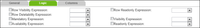
Note: All element types use the Logic tab. See Logic Tab for a description of the Mandatory, Availability, Visibility and Readonly fields. The additional fields displayed for Pick Tree Inline Grid and Popup Grid elements are shown here. |
|||
|
Card Visibility Expression |
Person Involved Tab
|
Similar to row visibility expression in a standard pop-up grid, this field determines when cards are shown to users. Choose one of the following options:
|
|
|
Card Deletability Expression |
Person Involved Tab |
Similar to Row Deletability expression in a standard pop-up grid, this field determines when cards can be deleted by user. Choose one of the following options:
|
|
|
Card ReadOnly Expression |
Person Involved Tab
|
Similar to Row ReadOnly expression in a standard pop-grid, this field determines when cards are read-only. Choose one of the following options:
|
|
|
Filter Expression |
Cross Reference |
Allows you to display a subset of options (i.e. based on the cross reference that is being used - see Available Cross References) for linking cross references. For example, in RL6: PeerReview, if you are linking persons involved to a timeline event, you may want to create a calculated expression to display only providers. Choose an option:
Note: When calculating filters for Cross Reference, you must use fields from the Cross Reference table. |
|
|
Row Deletability |
Inline Grid |
The default is True. Check the Row Deletability box and choose:
|
|
|
Row Visibility |
Inline Grid |
The default is True. Check the Row Visibility box and choose:
|
|
|
|
Inline Summary View Expression |
Popup Grid |
This option is used for the purpose of summarizing data from other parts (clusters, fields, pop-ups) which have been previously defined elsewhere in the form. An example of how this is used appears in the Investigation Overview tab of the standard RCA and PeerReview management forms. As data is entered in other parts of the form, matching elements are updated in the Investigation Overview tab to provide a read-only summary of the file. Check the Inline Summary View box and choose:
|
|
|
Row Readonly |
Inline Grid Html Link Grid |
The default is False. Check the Row Readonly box and choose:
|
|
|
Root Cause Expression |
Pick Tree |
Check the Root Cause box and choose:
|
|
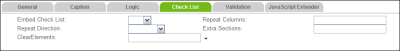
Note: The tab is only seen for Field elements. |
|||
|
|
Clear Elements |
Field |
Choose the field(s) that should be reset to empty when a value is selected from this field. If multiple fields are entered, be sure that no spaces exist between the field IDs, which are separated by commas. This field must also be set to do a Post Back (Refreshing Sections in a Form) to clear the other elements. |
|
|
Field |
This value is only used for Note: If Embed Check List is set to true, postback will not occur for the form as it would for unembedded multi-pick lists. |
|
|
|
Extra Sections |
Field |
Enter the |
|
|
Repeat Columns |
Field |
When this setting is left blank, only one column is used for the embedded multipick list. When set to Note: This field is only used with multi-pick fields ( |
|
Repeat Direction |
Field |
Sets the listing of multipick items to be read across (by selecting Note: This field is only used with multi-pick fields ( |
|
|
Note: This tab is only seen for Field elements, and is not available for responsive forms. |
|||
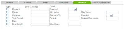
|
Type |
Field |
The kind of validation that you would like to perform on the field as soon as the value is entered into the field (i.e., type in a value and press tab for the validation to take place). The validation is also checked when the form is saved. For each type, you must complete the corresponding Error Message
|
|
|
|
Error Message |
Field |
The error message to display to the user when the validation type fails. |
|
|
Check |
Field |
The details of the validation type. For example, whether the field is required, is between a two numeric values or is under a certain length can be set here.
|
|
Note: The tab is only seen for Field elements. |
|||
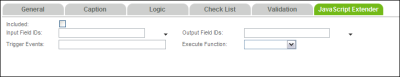
|
|
Included |
Field |
Check this box if you wish to use a javascript function on this field. |
|
|
Input Field IDs |
Field |
The field(s) whose value(s) you would like to send into the JavaScript function. Note: If using multiple field IDs, separate them with commas without any space after the commas. |
|
|
Output Field IDs |
Field |
The field that should be updated as a result of the function execution. Note: If using multiple field IDs, separate them with commas without any space after the comma |
|
|
Trigger Events |
Field |
When the JavaScript function should be executed (e.g., |
|
|
Execute Function |
Field |
The name of the JavaScript function that should be executed. The following options are available:
|
|
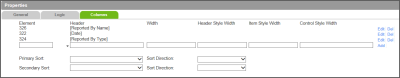
Note: This tab is only seen for Popup Grid and Inline Grid elements. In order to create a new grid, you must define at least one column before saving the form or editing another element. |
|||
|
Add |
Popup Grid |
Click the Add link when you have finished configuring the field. |
|
|
Control Style Width |
Popup Grid |
Ignore this field. Use the Width field instead. |
|
|
Del |
Popup Grid Cross Reference |
Click the Del link to remove the column from the grid. |
|
|
|
Element |
Popup Grid Cross Reference Html Link Grid |
Use the field picker to select the field to use for one of the columns in the grid. |
|
|
Header |
Popup Grid |
The title that appears in the grey row at the top of the grid. This should be descriptive enough that users understand what should be (or was) entered for this cell of the grid. |
|
|
Header Style Width |
Popup Grid |
Ignore this field. Use the Width field instead. |
|
|
Item Style Width |
Popup Grid |
Ignore this field. Use the Width field instead. |
|
|
Primary Sort/Sort Direction |
Popup Grid |
This field allows you to choose the column by which data is primarily sorted. For example, if you have added a date column, you can choose Date from the Primary Sort drop-down and then choose Ascending (i.e. oldest to newest, least to greatest, A to Z) or Descending (i.e. newest to oldest, greatest to least, Z to A) from the Sort Direction drop-down menu. |
|
|
Secondary Sort |
Popup Grid |
This field allows you to choose the column that determines the secondary sort. For example, if the primary sort used the Date column, you can choose Time from the Secondary Sort drop-down and then choose Ascending (i.e. oldest to newest) or Descending (i.e. newest to oldest). Records with the same date are then sorted by Time. |
|
|
Width |
Popup Grid |
A percentage used to control the size of each column. Leaving this field empty will ensure that all columns of the grid are the same size. If you do specify a percentage, ensure that the columns total to |
|
|
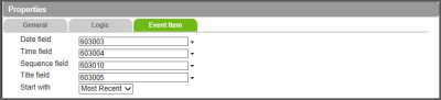
|||
|
|
Date Field |
Event Timeline |
The date field in the Event Timeline component which sorts events based on date and sequence of events. |
|
|
Time Field |
Event Timeline |
The time field in the Event Timeline component which sorts events based on date and sequence of events. |
|
|
Sequence field |
Event Timeline |
For the Event Timeline component, choose Sequence from the Timeline entity table. This is a hidden field and is used to controlled by the system to order the events. |
|
|
Title field |
Event Timeline |
The title for the event in the Event Timeline component. |
|
|
Start With |
Event Timeline |
This determines the sort order of the timeline events. Choose one of the following options:
|
|
Show Field Caption |
Vertical Tabs Person Involved Tab Review Tab |
Determines whether or not the Caption for the field elements will be displayed in the Card List. Choose one of the following:
|
|
|
|
Field Caption Width (%) |
Vertical Tabs Person Involved Tab Review Tab |
Allows you to determine the percentage of space allotted for the field caption in the row. For example, if you enter 50, half of the space in the row will be allotted for the field caption while the other half will be allotted to field content. Note: This is only used if Show Field Caption is set to True and is optional. |
|
*Use these fields to determine which elements (i.e. field from the Card Detail view) to be displayed in the cards in the card list and how they will be displayed. If no field is specified, the cards in the left panel are blank. |
Element* |
Vertical Tabs |
This determines which fields from the table are to be displayed in the card list. To add a field, go to the blank row at the bottom of the list. Note: You must have a minimum of one element and a maximum of three (3) elements defined in the Card Fields Tab. |
|
Caption* |
Vertical Tabs |
Enter a label for the element to be displayed in the Card List. Note: This is only used if Show Field Caption is set to True. |
|
|
Row Span* |
Vertical Tabs |
Enter the maximum number of rows allowed for the field. Note: For a card, the minimum number or rows is 1 and maximum number of rows is 4. |
|
|
|
Sort Order* |
Vertical Tabs |
Users can specify up to a 3-level sort based on the three fields displayed on the tab. If no sorting is specified, then the sequence is displayed in the order that the cards are added. Only positive integers can be entered. |
|
|
Sort Direction* |
Vertical Tabs |
If a Sort Order has been defined, choose Ascending or Descending to determine if the elements will be sorted in ascending or descending direction. |
|
|
Extra CSS Class* |
Vertical Tabs Person Involved Tab Review Tab |
A unique identifier for a custom CSS used to restyle components within the form. Note: The standard form has a CSS that controls the form design. This field is optional. |
|
|
|||
|
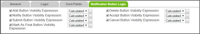
Add Button Visibility Expression |
Person Involved Tab Review Tab |
This field determines visibility for the Add button. Choose one of the following options:
|
|
|
Delete Button Visibility Expression |
Person Involved Tab Review Tab |
This field determines visibility for the Delete button. Choose one of the following options:
|
|
|
|
Send Button Visibility Expression |
Person Involved Tab |
This field determines visibility for the Send button. Choose one of the following options:
|
|
Acknowledge Button Visibility Expression |
Person Involved Tab |
This field determines visibility for the Acknowledge button. Choose one of the following options:
|
|
|
Notify Button Visibility Expression |
Review Tab |
This field determines visibility for the Notify button. Choose one of the following options:
|
|
|
Accept Button Visibility Expression |
Review Tab |
This field determines visibility for the Accept button. Choose one of the following options:
|
|
|
Submit Button Visibility Expression |
Review Tab |
This field determines visibility for the Submit button. Choose one of the following options:
|
|
|
Mark as final Button Visibility Expression |
Review Tab |
This field determines visibility for the Mark as Final button. Choose one of the following options:
|
|
|
Cancel Button Visibility Expression |
Review Tab |
This field determines visibility for the Cancel button. Choose one of the following options:
|
|